The organization was undergoing a complete digital transformation and I was part of the team which is responsible for creating a Design system.
client: reliance industries
the challenge
To create a shared repository of reusable components(UI, UX, Design and code) and standardise guidelines in all platforms to maintain consistency ie; Web, iOS and Android.
Bring all the departments to adopt the Design system and leave space for the system to adapt and evolve becoming an integral part of the company.
the result
Design System brought Efficiency, Consistency and lead scrum teams to build faster products at scale.
Successfully brought order in chaos or 'Organized chaos' is what we call it.
The Digital Transformation. Its was the buzz word around the office campus. The whole company is transforming into the digital age. It has ambitious goals. The organization owns one of the largest telecom services in the world by subscribers and provides the cheapest and most reliable internet services in the country. The Internet is everywhere!
The organization owns around 20 different companies and everyone is going digital. Up until then all of these companies are different level of digitalization and bringing all of them into the same level is the mammoth challenge.
There were dozens of smart designers, developers, product managers all working together towards the common goal. A goal to create a design system. We were set out to find all defining features such as design, experience, interfaces, Information Architectures, code, module libraries, app libraries, fonts, icons and many more. A Design System which can be nurtured. I was responsible for the creative user experience element of the Design system.
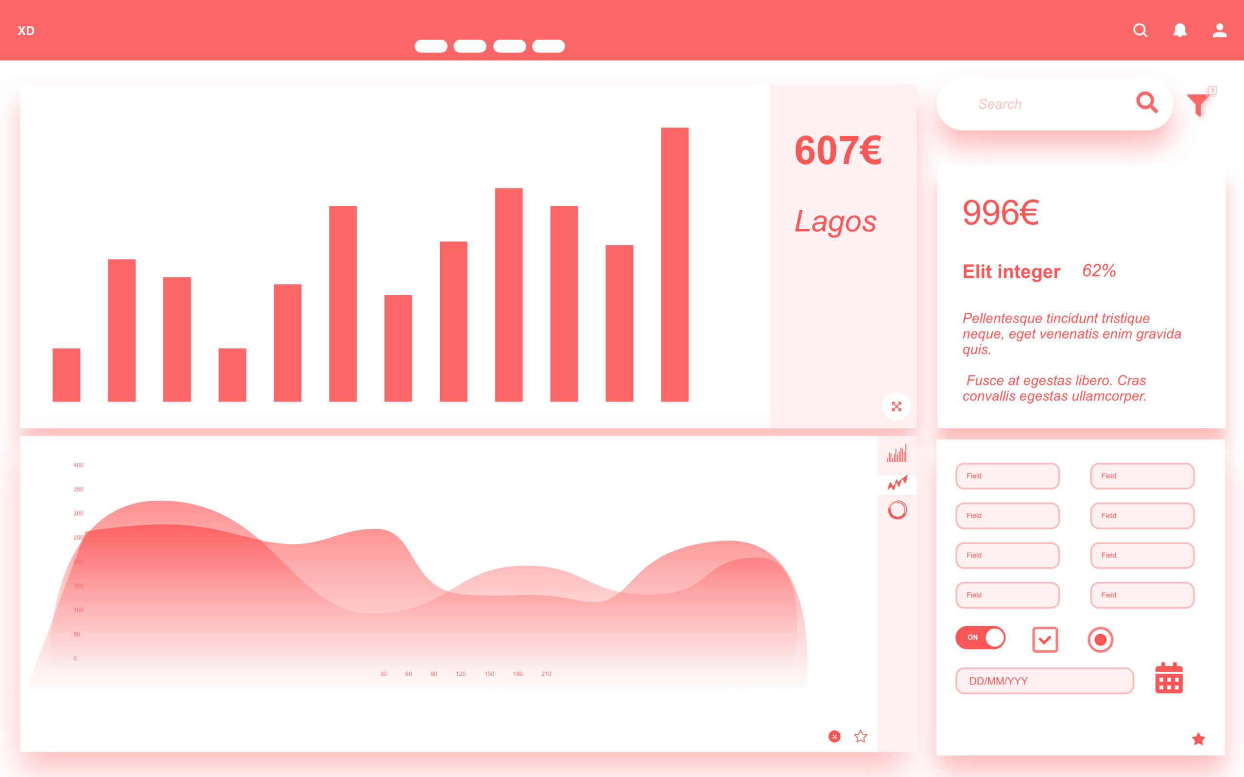
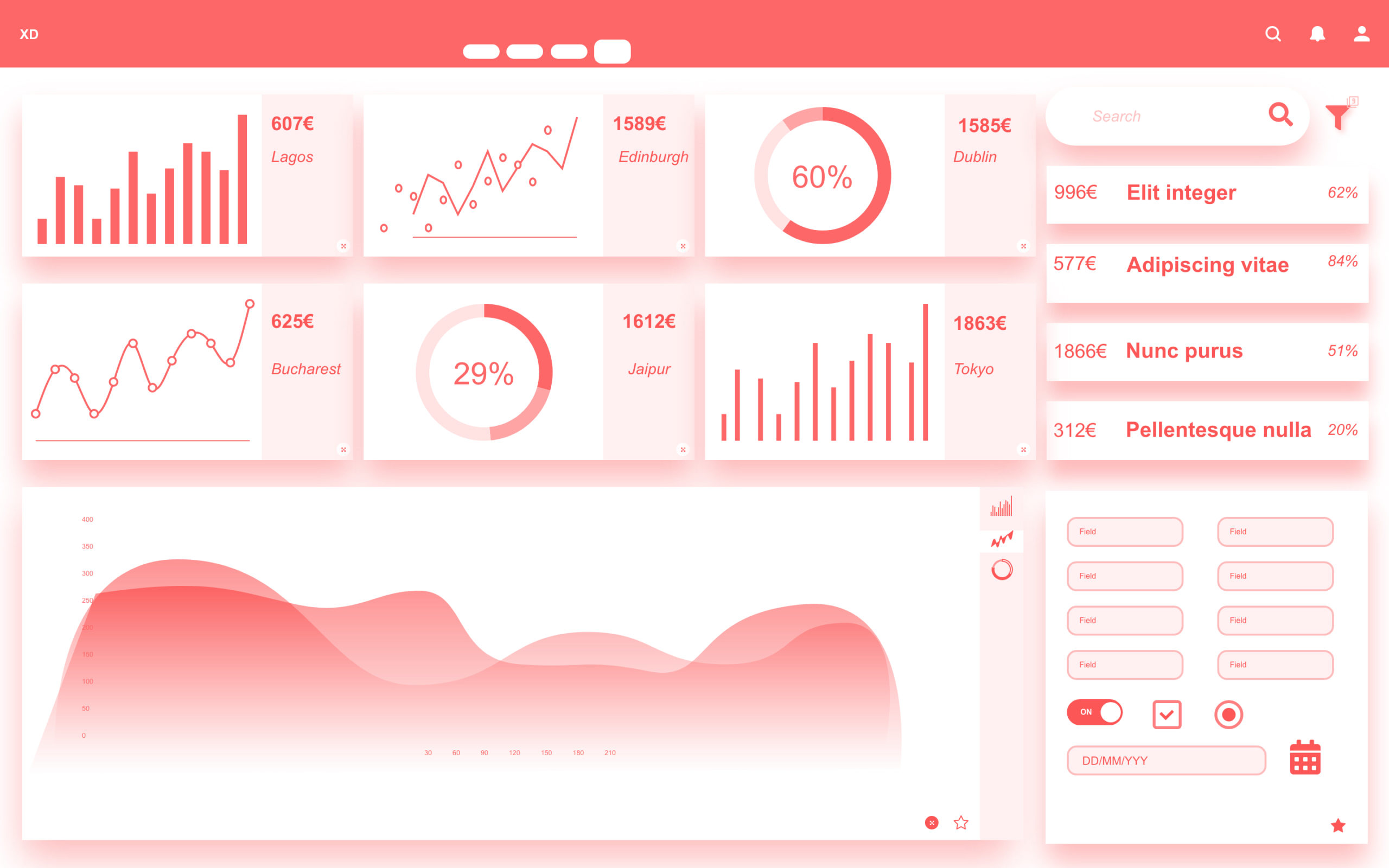
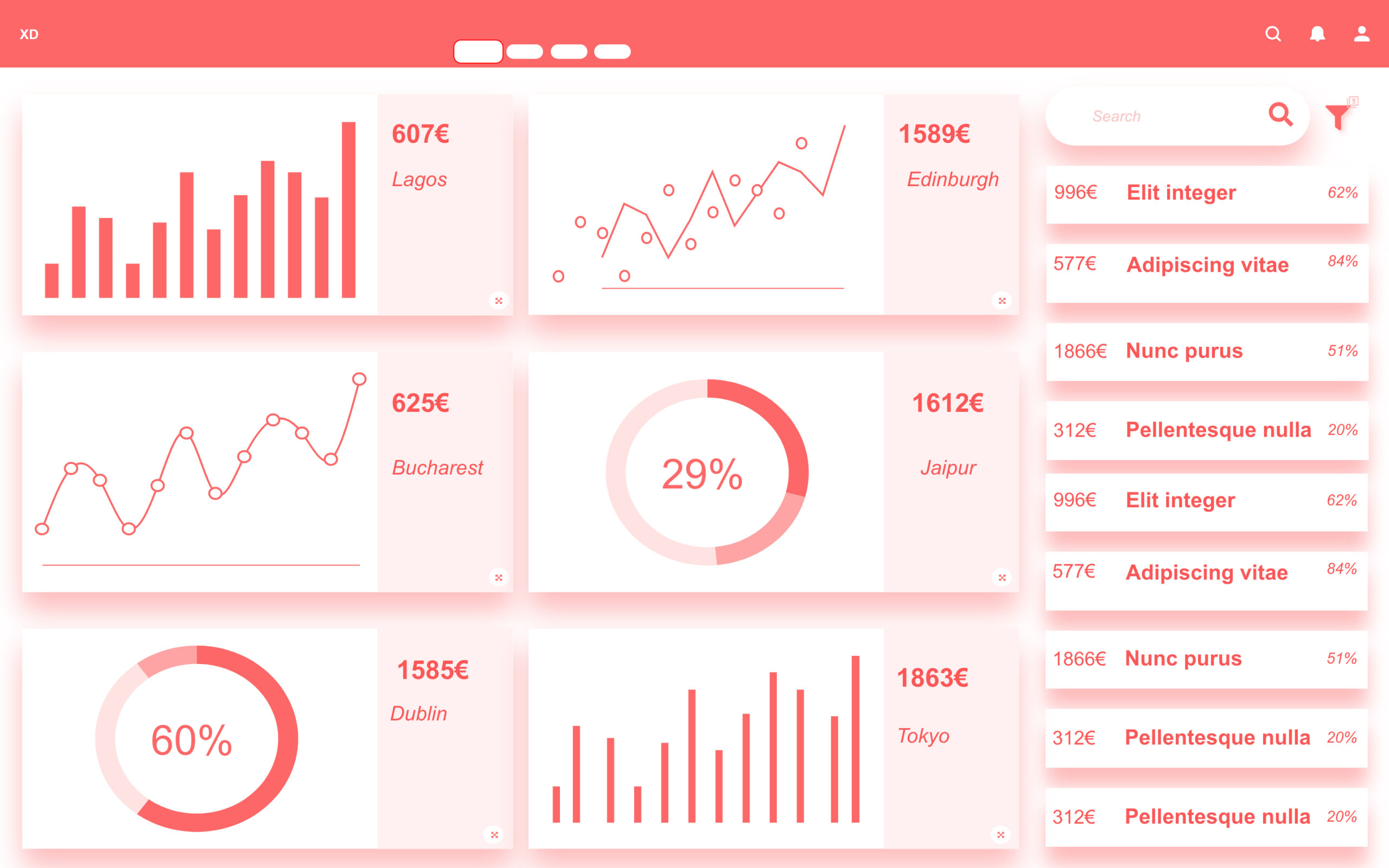
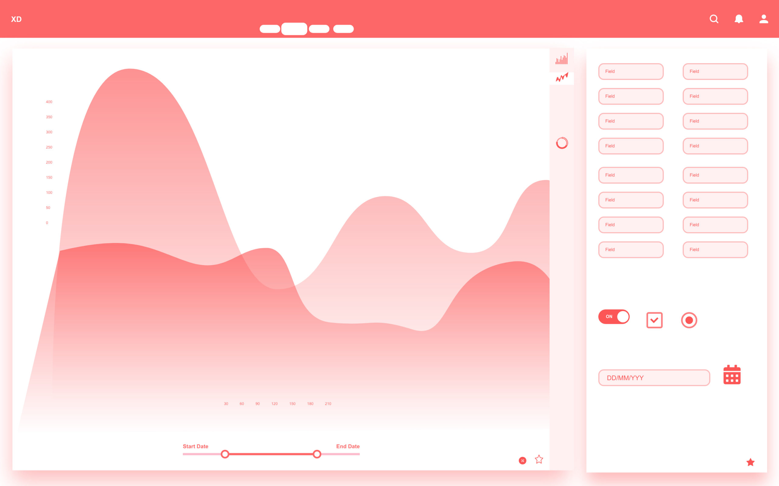
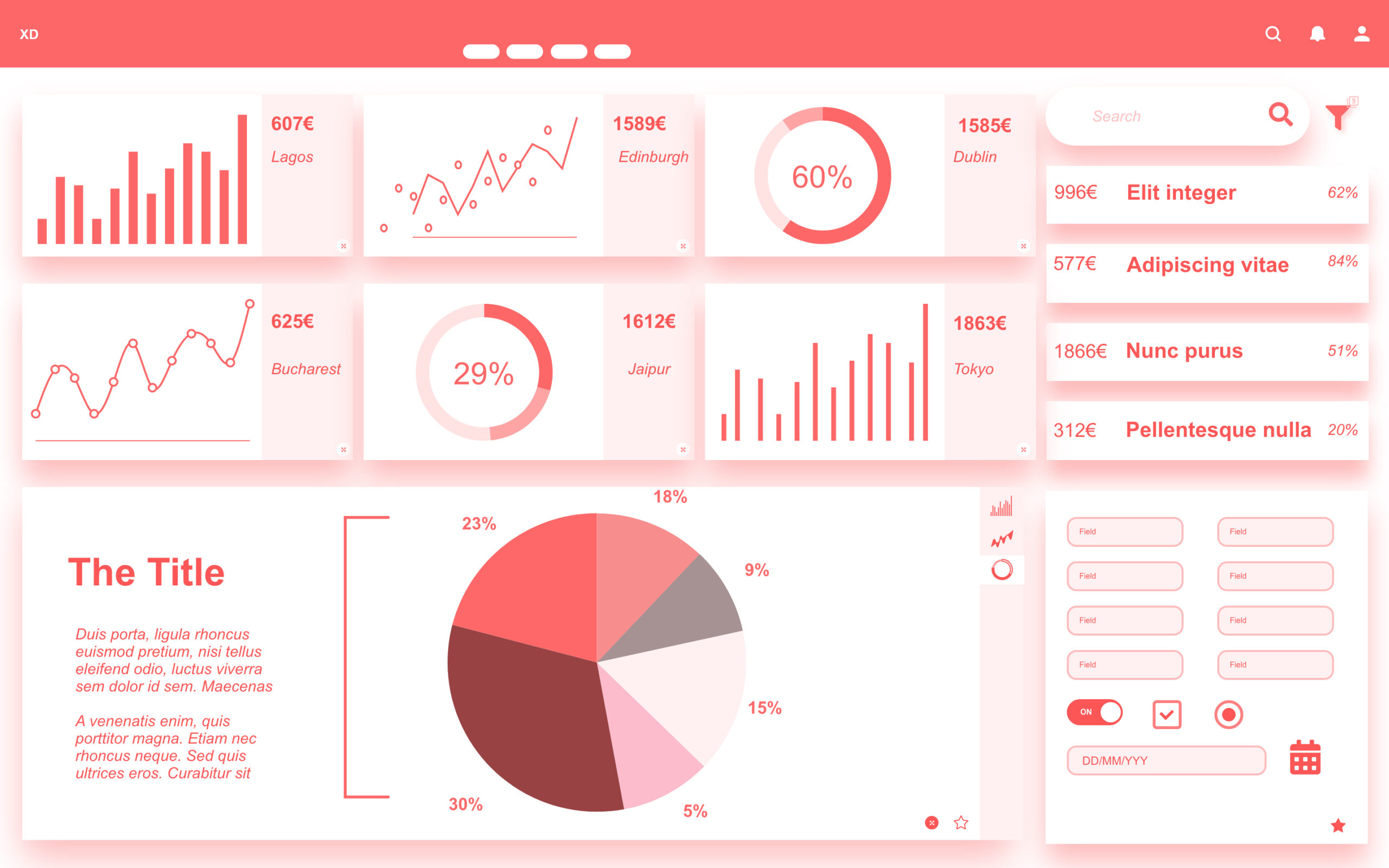
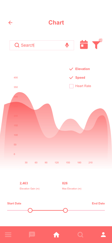
spend analytics Dashboard:
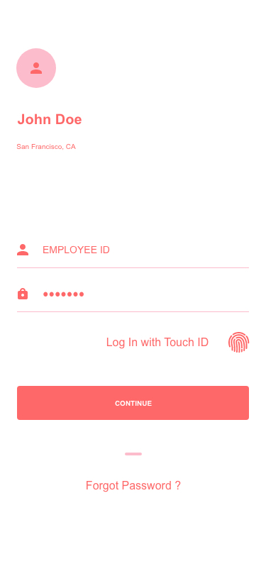
Mobile UX guidlines
Challenge:
" I am always on the move, I am happy there is a mobile version of ESS. It is not a big improvement though. The session expires in few mins or if I hit back out of the app. I have to put my login credentials every time. Imagine doing that 100 times in a day, it's so frustrating " - Employees
" Security is taken very seriously in our org. We already had few data breaches" - Corporate
Solutions:
• Touch log in makes it easy for off-site use, and can access to only the essential features.
• Easy login in company-issued laptop and employees can scan a barcode for extended login and access advanced features.
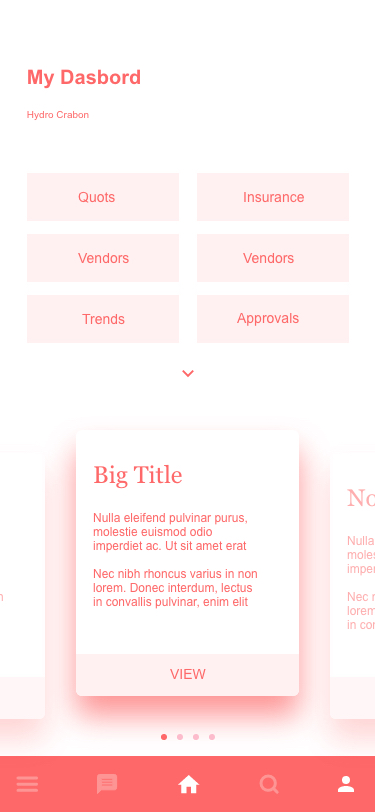
Challenge:
" I am a Business Analyst, I don't have access to all the data. It is stupid that my scree is cramped with unnecessary data I don't or can't use. I only want to see the things I use! " - Employees
" I mostly use my dashboard on mobile to view data. I don't edit anything. I panic when I accidentally touch edit which happens all the time by the way and data gets edited. I don't want that! " - Employees
Solutions:
• Auto-hide greyed out sections in the mobile app so the user had a clear view of his dashboard.
• User testing showed a specific pattern most users follow using their dashboard and it's not; step A to B and then to C. The IA is designed in a way it facilitates the user unconventional habits.
• Majority of users use App for view only. I removed unnecessary tools of like edit, save etc. in the primary view. Users have the option to choose the edit mode where they can edit, save, share etc.
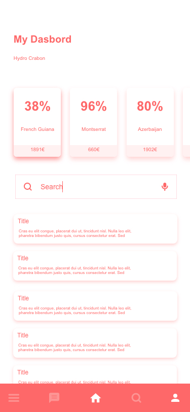
Challenge:
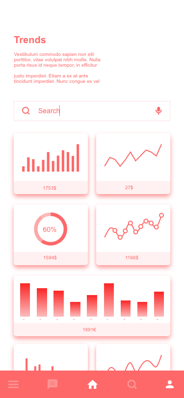
" My Dashboard has so may tickets, Items or lots sometimes in thousands. It would suck to scroll all the way. I like the search option but its not good. It fetches so may things and I have to scroll again. I wake up, eat, scroll and sleep. That's my life! " - Employees
Solutions:
• There is 'Search' and there is 'Filter'. Search is quick but not precise and Filter is slow but fetches precise info. A combination of Search Filters can do the trick.
• Users can save their fav filters, auto fetching from the previous session and have version history.
• Separation of Filter and Search options as some users are exploring the data and some are looking for precise data. Also, the option to combine search data with filter parameters.
• With Machine learning we took it a step further and customise the view based on frequent search, last viewed and favorites.
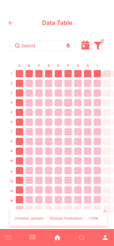
Challenge:
" We often have big data tables, maybe 20 rows and 30 columns. It's difficult as it is to navigate them on my laptop on my mobile? I don't think so..." Employees
User Interview:
Me: what makes you think you cannot use big tables on mobile?
Ans: I cannot see everything .. Duh?!
Me: Do you often have to see every cell?
Ans: Well ... not every cell. It depends on the task, I look to compare. How much we spent in Russia Vs in China. Numbers, resources etc.
Me: What do you do when you have to find something specific?
Ans: I just search for it... I mean it's stupid to scroll all the time right?
Me: What do you use these tables most of the time?
Ans: Comparing and Filling and maintaining that's all...
Solutions:
• With limited real estate on mobile designing a table interface for users won't work. The table should react with the search parameters the users prefer to use.
• User flow: 1. Search filter parameters, 2. Press and hold to multi-select and 3. options to compare the data.
• Editing or maintaining data is reserved to a moderator and can only be done on PC ( Data security and avoids confusion or errors).